Heat Maps, Puppies and Landing Pages
I received an offer last week to beta Attention Wizard’s new heatmap program. This new service is great for helping to determining the projected eye path of visitors to your landing page or as they write ”AttentionWizard uses advanced artificial intelligence algorithms to simulate human visual processing and attention. Our software instantly creates an “attention heatmap” of your Web page that predicts where real people would look during the first few seconds of their visit.”
Let me say I was impressed that someone had sat down and mapped in all the landing page variables a test of this nature would require. Up until this time the only options for tracking eye movement on a landing page was using a company with paid participants to scan your page hooked to a laser unit much like the focus group member pictured here. I was also impressed when I saw that they were offering it up in a classic marketing ploy of the “Puppy Dog Close” which is one of my favorite sales tactics from my old days of working in a pet store, but more on that later.

What got me to thinking about this post subject was how far we’ve come in the evolution of the landing page as the landing page we see today is very different from the pages from just a few years back when we were more worried about what we sold then the look or the message. Back in the “olden days” if we could get a top 20 SERP or an ad about our product/service in front of the searcher then we had a pretty good chance of converting that customer to buy, of course their needed to be a reduced field of competitors and yes it had to be someone motivated enough to want it as well as have the money to buy it and yes he had to be very trusting.
It was in 2005 that Bryan Eisenberg offered that a successful landing page must answer the following questions:
- What’s the offer?
- Who’s interested?
- Why are they interested, and why should they take further action?
- How do they get started?
Also around that time customer data master Jim Novo conducted this 3 part test:
1. Visitors were sent to a home page containing content addressing three different offers in a generic, high-level manner. Prominent links to more information were readily visible on the page.
2. Custom landing pages were developed and written to match each search term used.
3. Google traffic was separated from other search engines’ combined traffic to compare results.
When the tests were complete his results showed conclusively that:
- When visitors landed on the generic home page, they stayed longer and visited more pages. Yet a larger percentage left without converting.
- When visitors landed on custom pages, they stayed for less time and viewed fewer pages. But these visitors converted two to three times more than the visitors to generic landing pages.
That made custom landing pages the “nouvelle chose à faire”
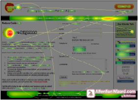
Now we have a program that can help us determine how people may view our landing page without anyone ever looking at it. It just so happened I was working on a landing page for our new service offering MorePro Express and decided to put it through the paces. After running the page through the system I got back a recognizable heatmap that showed me the main reference was the new service logo which I had in the content as opposed to the header where our standard logo is located.
The other points of reference in descending order were our top menu, our slogan and bottom menu followed by (to a lesser degree) our content. So what this says is that our new logo and menu are more important to a visitor then our content. This is comparable to a lion eating the hair off the head of a native before he decides to get to the meat. In all things related to conversion, it’s the meat we have to worry about.

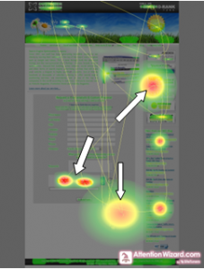
Well that got me to thinking about how my competitors scored so I ran a few of their landing pages. I am not identifying these test pages as I am not critiquing these designs just the way the program views them. The results of the first test were interesting as this competitor’s main visual reference was the certificates on the side followed by his Capcha script

The next landing page showed the focus point starting in the middle with the graphic of a group of people standing together next to the Search Engines certificate badges then proceeded to the far right side element then to the left side free buttons.

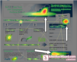
The last landing page showed the focus point starting with the graphic at the top which was the natural eye path then proceeded to the next sales element then to the call to action at the bottom of the page.

Not bad for a service in beta and one who I’m sure will improve after (as we say) all the monkeys have hit the keys.
These results, while helping us determine the focal paths of our pages, still leave me still searching for the answer as to “how do I design a landing page that works for service companies”. Too many times the onus is put on the design of the page as opposed to the content. We are so busy making sure the page elements are properly positioned using the right color, size and location that we forget the meat of the page which is good copy. This works when the object of a search is for a product because they can see it, size it and in some cases download it before buying it. But a service such as the one we and our competitors offer are not able to provide a taste test. This may be changing and I’ll cover that in the next Grab Bag post


Leave A Comment